OpenTelemetry from first principles
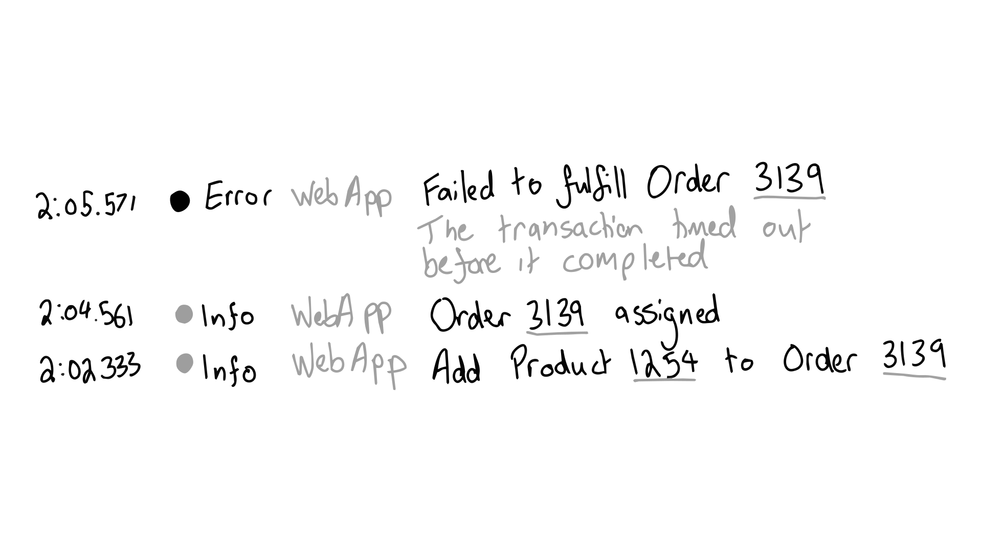
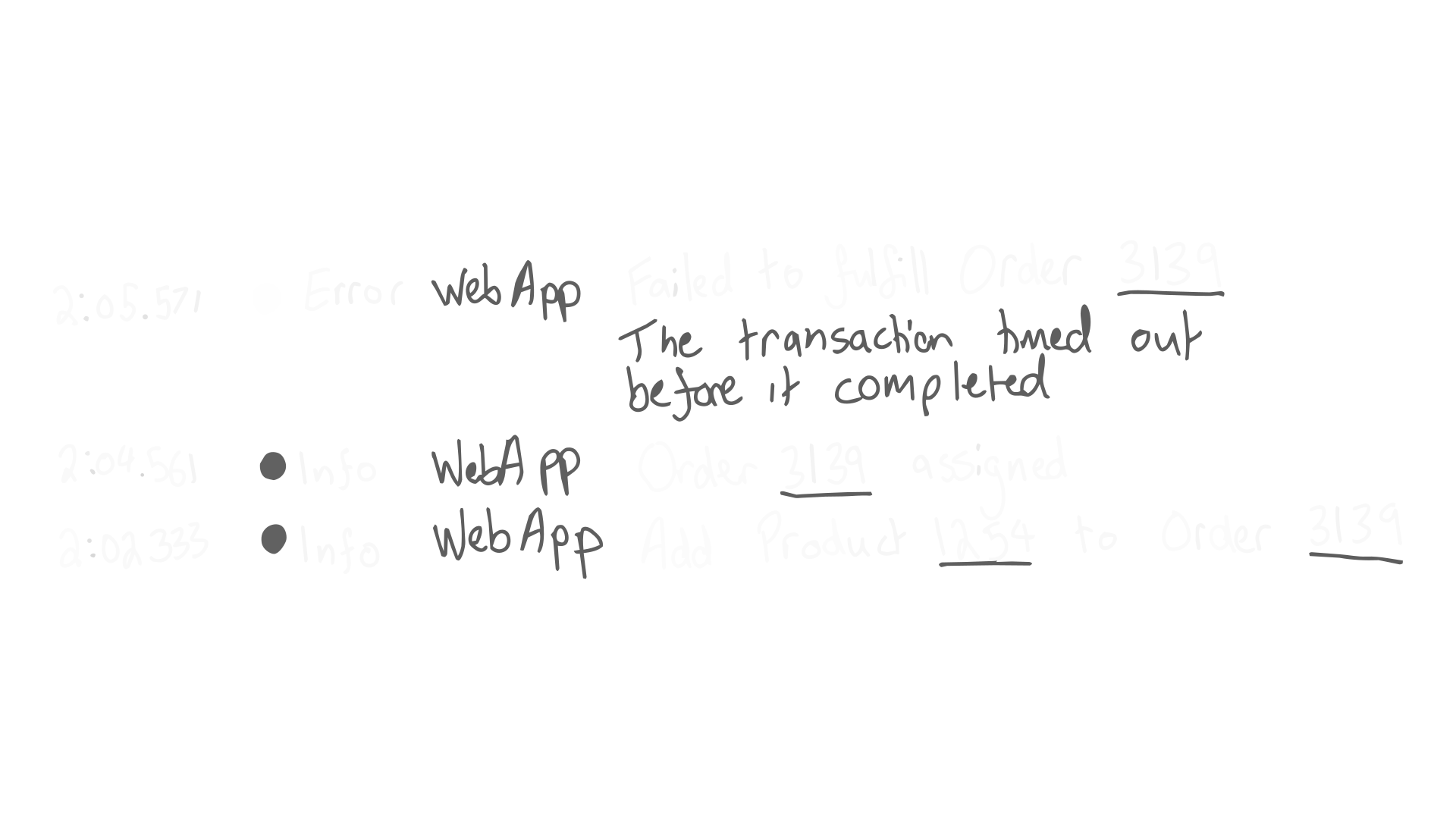
1:1 When something notable happens in your system, you emit an event for it. An event has a timestamp that tells you when it happened. It has a user-facing message that tells you what happened. It has contextual data that tells you where and why it happened.
1:2 Some events are more important that others so you categorise them by their severity. Higher severity events can be distinguished from, and handled differently to, lower severity ones.
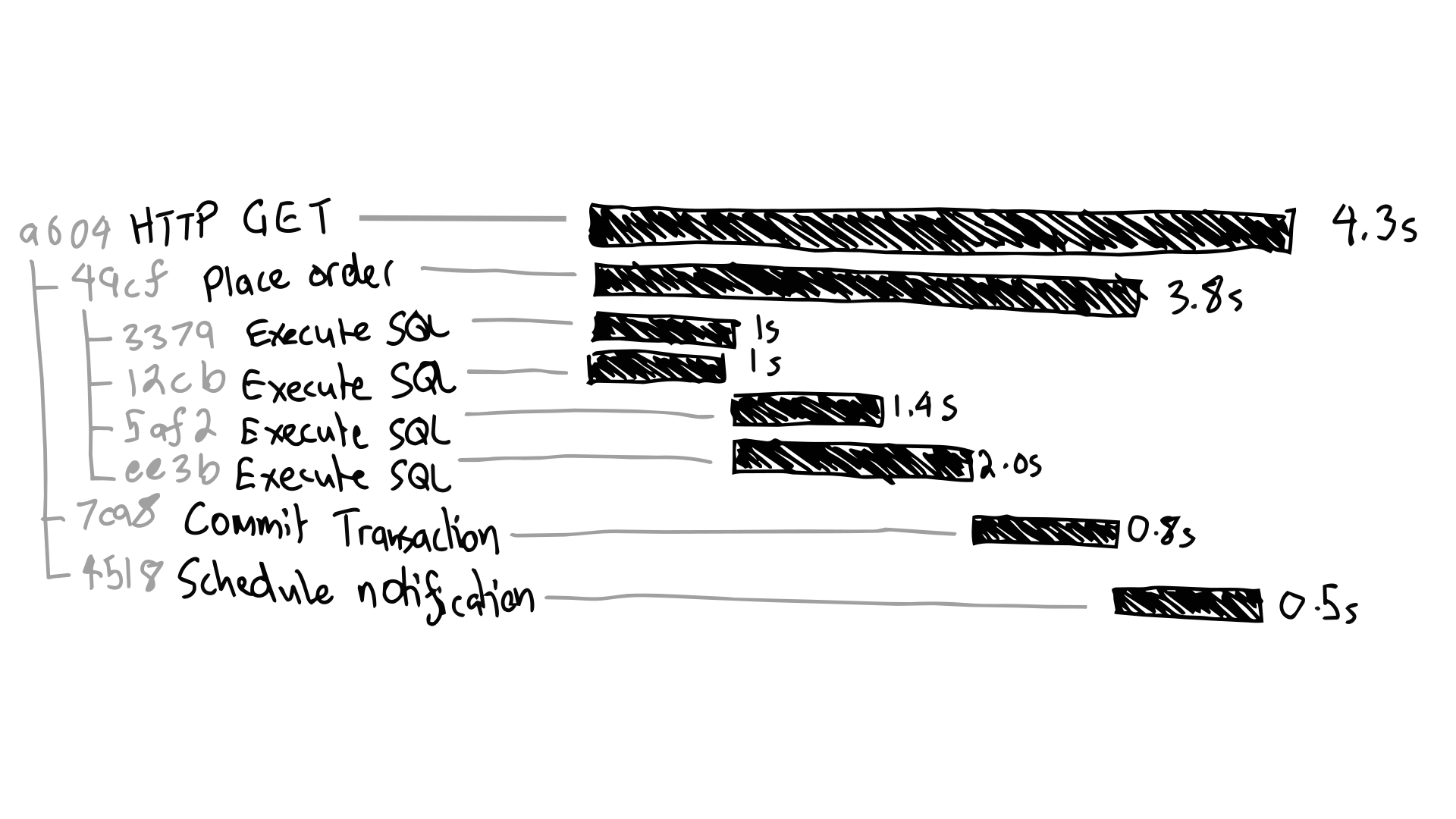
2:1 Your system is organised into procedures, both logically, and mechanically. Procedures take time, and that’s useful information, so you emit an event when they complete with both the time they started, and the time they ended. That span of time lets you calculate how long they took.
2:2 You want to correlate events emitted by the same procedure, so you add a shared identifier to them. Each invocation of a procedure is assigned a unique identifier. Procedures call eachother, so you organise their identifiers into a hierarchy. The caller becomes the parent, and callees become the children.
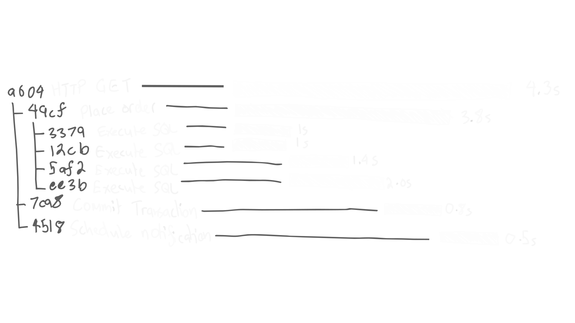
2:3 Your system makes inter-process calls that are logically part of the same procedure. You want these to be correlated too, so you include the caller’s identifier as a header when making remote calls. The callee then reconstitutes it as if they were called directly in-process.
2:4 Tracing procedures is expensive, both in production, and in retention. Instead of recording a trace for every procedure call, you retain a subset that sufficiently represents the whole set. You decide to trace a procedure upfront before its outer-most call, or you defer the decision to some later point when events from the trace are available. The decision to record a trace for a procedure is independent from the decision to retain other events they produce.
3:1 Continuous data streams, like resource utilisation, don’t naturally map onto events. You emit events from them by sampling their current value at regular intervals. The frequency of sampling trades volume for resolution. Sampling with different aggregations retains different properties of the underlying data.
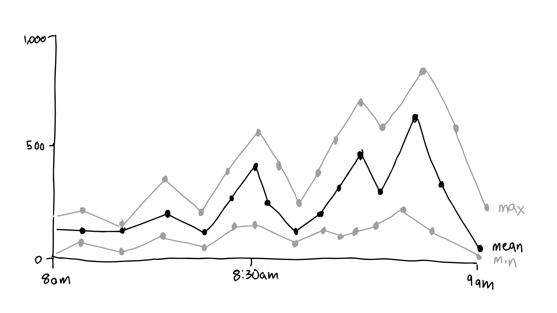
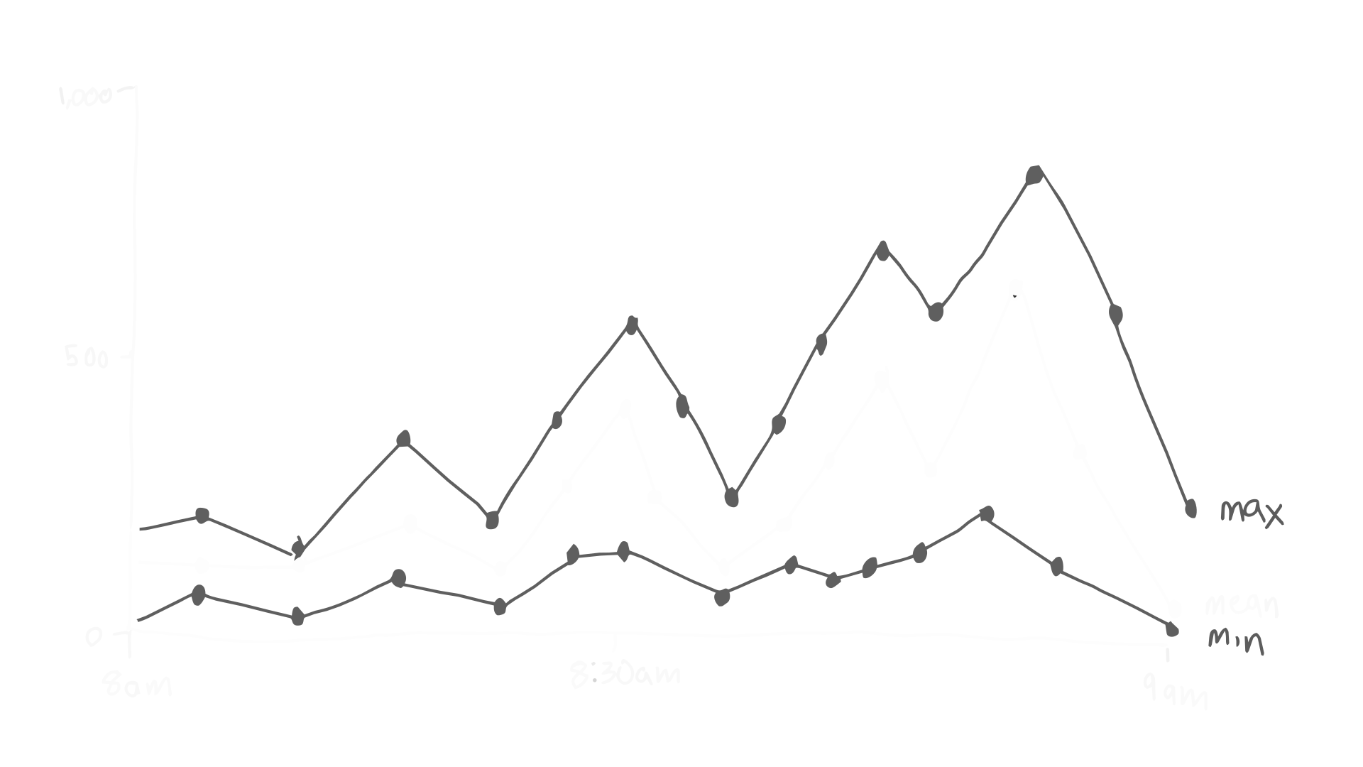
3:2 You compress events by counting their occurrence instead of emitting them directly, making them both cheaper to produce, and to retain. You sample the count at regular intervals, just like continuous data streams.
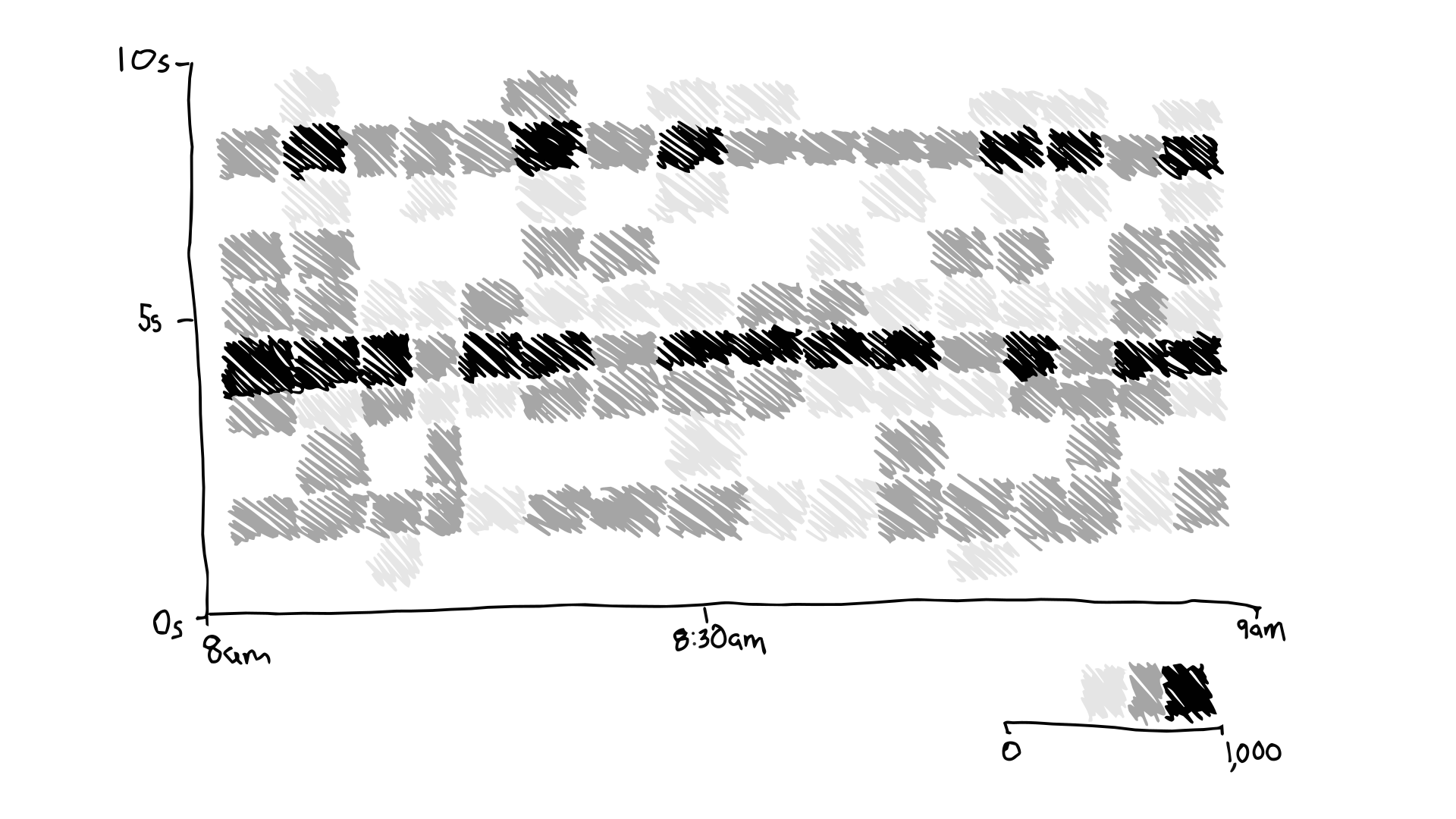
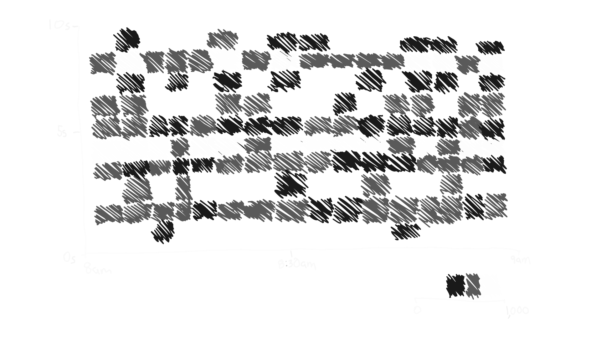
3:3 When compressing procedures that take time, you don’t just want to know how many calls were made, you also want to know how long they took. You divide the total count into buckets by duration, with procedures taking about the same time sharing the same bucket. Bucket granularity trades volume for resolution.
Good diagnostics compress and externalise the state of your systems with sufficient detail to understand and manage them from the outside. We’ve just covered the three main observability signals that make up OpenTelemetry; logs (1:x), traces (2:x), and metrics (3:x). I’ve presented them as a neat series of incremental progressions, but the real history isn’t so serial. Each one has evolved to serve different needs at different times. Many systems today make use of all of these generic signals, plus others that may be more specialised. Over time, those specialisations that prove more broadly valuable find their way into the general toolkit, and the list grows.